Mother Jones, ultra-liberal blog/mag was cited in a link by a Facebook friend today, who found it simply "scary". The article, entitled "It's the inequality, stupid" parroted the famous Clinton electioneering slogan, and claimed, in a series of charts with very little explanatory text, to nevertheless somehow explain "everything that's wrong with America". Of course the entire premise of the article is complete and rather childish nonsense, but I DO give full credit to the co-authors, Dave Gilson and Carolyn Perot for posting source links to their distorted leftist eye-candy tripe.To the poster, I kept it civil and succinct: I honestly don't understand what's scary about somebody making more money than me. Seriously, that doesn't hurt me personally, and it's generally a good thing for the public too, because they have more to donate, more to invest, more reasons to hire people, and more to tax. If anyone would like to discuss it here, I'd be happy to.
However, I also promised a full blog post, so here it is...
Income disparity is a topic I've been exposed to since at least the 10th grade as somehow being the cause of all social ills. The cliché, no matter how demonstrably false and no matter how frequently debunked, somehow stands to "reason" in the liberal mindset that: the rich keep getting richer and the poor keep getting poorer. Although the first proposition, that the rich keep getting richer, is completely incontrovertible, I have yet to see an honest evaluation of available statistics to prove the latter, that the poor are worse off because of the former. Rather, the evidence seems to show the truth of another cliché: a rising tide floats all boats.
But for this pair of malpracticing journalists, and for myself and others, I will be happy to set the record straight on each chart and either why it is distorted, or why it shouldn't be alarming.
Chart 1

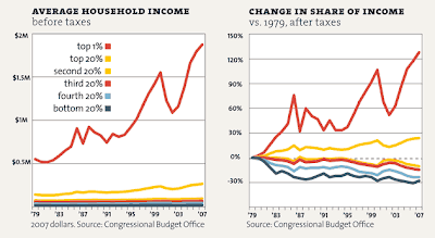 This one really blows my dishonesty meter off the scale. For Average Household Income, you just proved there's a huge disparity--couldn't you zoom in a little on the bottom 99% so we can at least tell if they grew a little?
Again: big whoop. Congressmen are rich. Wouldn't you rather have people who have succeeded in creating financial freedom for themselves, in producing so much for their fellow man that they have been rewarded with a large net worth in profit over and above the expenses they put in--wouldn't you rather have this kind of person volunteer to lead in government? They ARE volunteers, you know. And what's this about American families owning on average 120k worth of stuff! My whole house isn't worth that! One in 22 chance of being a millionaire? Are you serious? I thought we were all drowning in poverty! I thought 90% of us made on average 31k! I, for one, don't know many millionaires, but these stats show that they are rather INCREDIBLY common!
However, I also promised a full blog post, so here it is...
Income disparity is a topic I've been exposed to since at least the 10th grade as somehow being the cause of all social ills. The cliché, no matter how demonstrably false and no matter how frequently debunked, somehow stands to "reason" in the liberal mindset that: the rich keep getting richer and the poor keep getting poorer. Although the first proposition, that the rich keep getting richer, is completely incontrovertible, I have yet to see an honest evaluation of available statistics to prove the latter, that the poor are worse off because of the former. Rather, the evidence seems to show the truth of another cliché: a rising tide floats all boats.
But for this pair of malpracticing journalists, and for myself and others, I will be happy to set the record straight on each chart and either why it is distorted, or why it shouldn't be alarming.
Chart 1

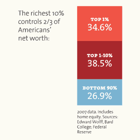
This is a huge disparity, to be sure, but now the question becomes what of it? If I were writing the headline, I would have chosen, "90% of Americans make over 31k!" Because I would be grateful to make more money than I am now (and 31k is WAY more). And since ALL of my salaries from now through the foreseeable future, in the field of academia, will likely come either from tax revenues or private endowments, I'm glad those super-rich exist. They support me and probably many thousands of others like me.
Chart 2

Again, a big: "so what?" Of course the rich control more property, and in higher proportions. The real issue should be whether opportunity exists equally for the bottom 90% to improve their holdings. To be rigorous, comparisons with an index of key comparable countries is required for proper contextualization of statistics such as this.
Charts 3-4
 This one really blows my dishonesty meter off the scale. For Average Household Income, you just proved there's a huge disparity--couldn't you zoom in a little on the bottom 99% so we can at least tell if they grew a little?
Hint: that's NOT what the chart next to it is doing.
Luckily, the Congressional Budget Office is the source for these two, and there's a link on the MoJo page. Looking at the data for every category EXCEPT the top-most one, the first chart now shows a little more detail:
Yup, just as right as rain, everyone's growing at about the rate of inflation, averaged out. The poor just aren't getting poorer, sorry. And when you look at only those making under 100k, the chart shows even better a slow but steady pattern of growth--of all boats rising.
Now if you were serious about making a case that the poor are getting poorer, you might want to map this against purchasing power indexes, because that would at least stand a chance of showing that even WITH the growth in income, the ability to buy things has diminished, but that's not what their chart does. It's deliberately trying to hide numbers that are NOT lying: growth there was, across the board.
But Chart 4 is just insidious. Change in Share of Income? What possible significance can there be to showing that the lower income bracket took home a smaller percentage of the total economic pie between 1979 and 2007? The whole PIE got larger! And the slice for even the poor bracket also got bigger in absolute terms. Why are you representing the RELATIVE terms? By no objective measure is the life of a poor person in the US WORSE than it was in 1979 in the days of gas lines and black-and-white TVs (YES, I know they were available earlier, but MY family didn't have one until about 1979), hyper-inflation, and low house ownership rates. In fact, even in the poor bracket, the average poor household owns their home, and has a vehicle, a cellphone, and two vivid color television sets.
Chart 5
This is an opinion poll. What it shows is Americans are bad guessers about how wealth is distributed in their own country. And that many of them erroneously believe that they should have a say in how much someone else makes. But when you really think about it, the fact that they're bad guessers is actually significant. People don't FEEL like they live in a place THAT unequal. It's rather evidence of the SUCCESS of the idea of America where classes are porous and where opportunity really is still pretty equal, at least in most people's perceptions. And as long as they perceive the existence of opportunities, they can act on them, and prove themselves right now matter how much more someone else owns than them.
Chart 6
Again: big whoop. Congressmen are rich. Wouldn't you rather have people who have succeeded in creating financial freedom for themselves, in producing so much for their fellow man that they have been rewarded with a large net worth in profit over and above the expenses they put in--wouldn't you rather have this kind of person volunteer to lead in government? They ARE volunteers, you know. And what's this about American families owning on average 120k worth of stuff! My whole house isn't worth that! One in 22 chance of being a millionaire? Are you serious? I thought we were all drowning in poverty! I thought 90% of us made on average 31k! I, for one, don't know many millionaires, but these stats show that they are rather INCREDIBLY common!
Charts 7 and 8
These consist of a list of congressmen with 100+M net worths, the top 10 in fact, then shows that all of the top 10 voted for continuing the Bush tax rates. I don't see anything bad or wrong there. Lower marginal tax rates allow productive people--non-public-sector people--to use more of their own money the way they see fit. This, in turn, leads to use of such freedom, in spending, investing, what-have-you. This produces more private-sector economic activity, creates more jobs, brings more people into higher tax brackets, and provides more revenue to the government. I'm glad even the congressional fat cats understand this and voted for it.
Chart 9

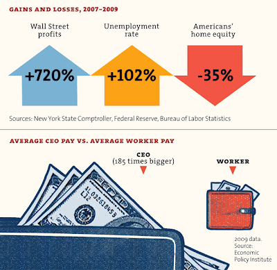
Again, is there anything but envy driving this kind of chart? Wall Street investing banks gained a large profit DESPITE an economic turn-down when housing prices fell and unemployment rose. What do you think the banks are DOING with the money? Storing it in silos and going for long swims in coin-filled pools? That was Scrooge McDuck, not real life. They INVEST it. They SPEND it on people, on building things, on jobs. How much higher do you think the unemployment rate would be if Wall Street had scored zero profits? And as for the disparity between CEO and worker pay, if a worker added THAT much value to his company (185x), he should break off and form his own and run it as the CEO. Being a CEO requires education, connections, big risks, big decisions, and big responsibilities. If a worker has all these, why is he still a worker? This is America, go get rich.
Charts 10-11

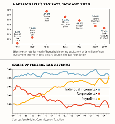
I won't comment on the Millionaire Tax Rate chart except to say that the chart is dishonestly leaving OUT the fact that Wilson's top tax rate was 77%, and that when Mellon cut taxes under Coolidge, the federal coffers busted at the seams.
On the other hand, the Share of Federal Tax Revenue chart deserves a little closer look. First, it doesn't say how much revenue the feds actually got in any of these years, just the percentage of the source. Second, who do you think pays a "corporate" tax? It's a hidden tax, because in everything you purchase, the extra cost of the company paying its taxes is figured into your price. When corporate taxes go down, businesses can keep more of their money to spend, invest, hire, and compete. As competition increases, prices drop. All this means increased economic activity. Payroll taxes have increased the most, but this is most likely directly related to changes in the Medicare and Social Security situations and laws. In any case, what this chart is intended to show is that government is playing favorites with rich business owners who already have money and can spare it so you don't have to pay so much of your payroll. You'd pay it anyway, the chart is a canard. The only real way to decrease the amount of payroll taxes required for the sustenance of Ponzi scheme entitlement programs paying out to an increasing number of aging baby-boomers with decreasingly available funds and decreasing pools of new workers to fund the schemes, is to reform the entitlement payouts.
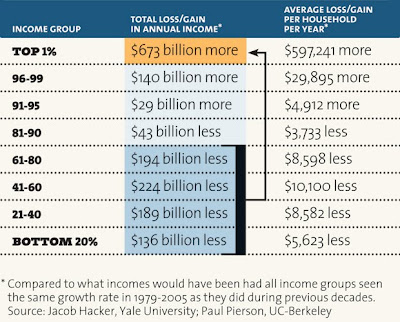
Finally chart 12 (see, they even lied about how many charts they had)

This one is just plain data manipulation poppycock. IF all income groups had grown the same during one time period than before? In what way is this a useful metric at all? No taking into account changes in the economy, no rationale for choosing one set of years over another, and no link to the source on this one. But even before picking it apart, why do Hacker and Pierson assume economies are static, zero-sum games? If the bottom 20% isn't growing their earnings at as quick a rate as the top 1% does that automatically mean that top 1% is stealing the difference from them? Complete non-sequitur. In truth, wealth is CREATED when a free exchange is made, and when a free being acts on a resource. The economy GROWS, and America is still free enough that even a cabal of rich people couldn't steal all the opportunities fro growth from the lower classes if they tried. The truth is that they don't. They help them along in the most efficient way possible--by free exchanges with them.
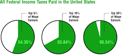
One last comment: they were MISSING a chart. The salient one that undermines all their theories about government taxation being able to "rectify" all these "inequalities" as they see them. Rush Limbaugh has it permanently posted on his website here.


Comments